SUBSCRIPTIONS UPDATE
Updating and differentiating one of our core features.
SUMMARY
PRODUCT
iOS
Android
ROLES
UX writer
Copywriter
Content marketer
TOOL
Adobe Xd
CONTEXT
Edison Mail is an independent email app used by millions worldwide to manage multiple email accounts in one place. During my time at Edison, I worked cross-functionally with the design and engineering teams to create UX copy and campaigns that promoted the usage of new and existing features.
This was a project I worked on with the design and engineering teams to introduce an update to one of our core features.
THE PROBLEM
How to differentiate Edison’s new subscriptions feature from the competition’s and encourage users to check it out
THE SOLUTION
Introduce the new feature in simple language that entices users to explore
WHAT I DID
Worked with our designers to conduct competitive research into subscription features found in other email apps
Drafted tweet copy and in-app copy describing the new feature
Partnered with our lead UX/UI designer to map out the user flow via wireframes
Wrote a blog post introducing the new feature to our users in simple language
INTRODUCTION
THE PROBLEM
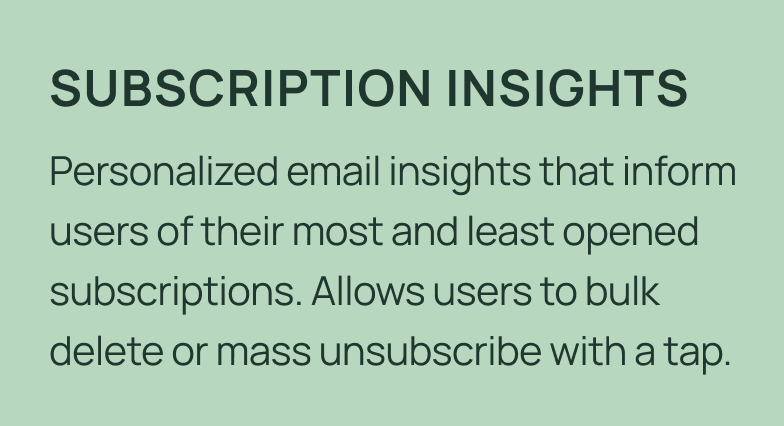
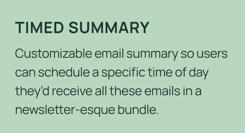
One of Edison Mail’s hallmark features is one-tap unsubscribe, a simple way for users to empty their inbox. However, as this feature became increasingly common amongst different email apps, our team realized that our unsubscribe needed a bit of an update in the form of subscription insights and a timed summary.
Subscription insights provides helpful information into the value that the user’s subscriptions actually offers in an easy to understand scoreboard, while the timed summary reduces notification fatigue by allowing users to schedule multiple email subscriptions to be delivered in a simple digest at a time that works best for them.
This project was led by our senior UX designer and me. I drafted all in-app copy, tweet copy, and helped to map out the user flow.
THE SOLUTION
Our VP of design had the idea of launching a two pronged update:
THE PROCESS
COMPETITIVE RESEARCH
We looked at three apps that are designed specifically to clear out user inboxes to see what we could bring into Edison Mail.
From this research, we pulled out several elements that we wanted to incorporate into the new features. When it came to features, we liked the roll up, card/list view, sorting, bulk actions, email stats, and push notification. For UI elements, we really liked how these apps were calming, smart, and helpful.
MY APPROACH + ITERATIONS
After doing some further research into other in-app event campaigns from competitors, I mapped out the timeline and the deliverables we needed to have this project go live by the new year. I partnered most closely with our senior UX designer to figure out exactly what we wanted it to look like. I worked closely with our senior UX designer to iron out the flow we wanted for our users.
Initially, inspired by Duolingo’s streak pop-up, we had the idea of rewarding our users who unsubscribed from 3, 5, and even 10 emails. However, we realized that this may start to feel too much like work for our users and that they would likely feel a bit annoyed by the process.
Initial pop-up idea
Instead, we decided to stick with an initial in-app pop-up that would encourage users to unsubscribe from junk followed by another screen that would auto-dismiss after a few seconds congratulating them for doing so. We mapped out two user flows: one from the App Store and the other from the app itself.
In flow one, users would click on the in-app event in the App Store, be taken to their Subscriptions tab, and see a pop-up about the event.
In flow two, users who opened their app as normal would be shown a pop-up that, when selected, would take them to the Subscriptions tab.
From there, both sets of users would be encouraged to unsubscribe from one newsletter, see a new disappearing pop-up congratulating them, and then be taken back to their Subscriptions tab.
User flow mock
Then came the process of figuring out what we wanted these pop-ups to say. I worked with my manager on a few different ideas until she encouraged me to stick with a headline that had a hard stat that would drive home to the user why it’s important to unsubscribe from junk mail. Below are some iterations we went through.
Pop-up copy ideas
We also spent some time discussing what the eye-catching headline would say in the in-app event. Eventually, we realized that the simplest option would be the best and went with “Clean Up Your Inbox!”
In-app event copy headline ideas
THE END RESULT
This ended up being an incredibly successful campaign, leading to:
An in-app event that ran for 16 days in the App Store, resulting in 1,500+ additional downloads
6,393,626 emails (or a 685% increase) unsubscribed from within 16 days
231,842 uses of our Delete All feature (or a 557% increase) within 16 days
A long coveted feature highlight on the Apple App Store
The in-app event
In-app pop-ups
REFLECTIONS
WHAT I DID WELL
I properly prioritized the planning process, made sure deadlines were met, and was able to ensure there was minimal lift required from my coworkers to make this project come to life.
I was also able to properly communicate all the plans with our Apple POC and this led to an App Store feature.
WHAT I WOULD DO DIFFERENTLY
Shorten the copy in the first pop-up. Looking at it now, it feels much too long.
Run A/B tests to see which option would perform better. Due to time and resource constraints we weren’t able to run tests, but next time I would like to.