BONFIRE ANALYTICS WEBSITE REDESIGN
Redesigning a website from the bottom up to prioritize inbound leads.
SUMMARY
PRODUCTS
Desktop
Mobile
ROLES
Designer
UX writer
Copywriter
Content strategist
TOOLS
Figma
Adobe Illustrator
Wix Studio
CONTEXT
Bonfire Analytics is an early-stage B2B startup that’s focused on helping health tech companies get connected to the patients and providers that are most in need of their products. I worked as their content design and marketing consultant to build their website, standardize their collateral + branding, and more.
For this project, I singlehandedly redesigned their entire website over the course of a month using Figma, Adobe Illustrator, and Wix Studio.
PROBLEM
Both the executive team and investors disliked the existing Bonfire Analytics website. It was seen as lackluster, and it failed to bring inbound leads.
SOLUTION
Begin from scratch and design a website with new icons, movement, and CTAs that had lower barrier to entry
WHAT I DID
Taught myself how to use Wix Studio on the fly
Analyzed existing website to understand where we needed to make improvements
Worked with our growth marketer to see what our competitors did well
Drafted copy with the executive team that would appeal to potential customers
Mapped out and designed entirely new pages and icons that illustrated what the platform offers
Chose a CTA with a lower barrier to entry
IMPACT
Inbound leads increased by 200% and investors + the executive team were very happy with the final result.
(Click on each image to get a closer look at our notes)
(Click on each image to get a closer look at our notes)
THE PROCESS
THE INITIAL SITE
While the original website provided good information about the Bonfire Analytics platform, we felt that the way it was presented could be improved upon. In addition, as we wanted to increase the number of inbound leads, we needed to figure out copy changes that made sense.
The biggest notes from our site audit were:
“Get in touch” is too salesy and scheduling a meeting immediately likely scares off top of funnel customers
As Bonfire Analytics is a small startup, people likely won’t watch a video explaining the product and would prefer something skimmable
Our site is giving solutions before addressing the problems customers face
The product screenshot was already out of date
Having social proof is good, but perhaps formatting could be improved
COMPETITIVE RESEARCH
Our growth marketing lead took an initial pass at highlighting our competitors’ sites, and together we brainstormed what it was about these websites we liked, and what we didn’t. Through this analysis, we were able to see what elements of their websites we wanted to incorporate into our own.
These included:
Speak directly to the customer and utilize more CTAs
Make getting in contact/getting more information as low pressure and simple as possible
Include social proof via customer images or testimonials
Clearly state the value proposition of the product in a way that could be easily skimmed
OUR THOUGHT PROCESS
When changing the website, we paid close attention to how we wanted the potential customer to feel. We want them to be made aware of their problems, but feel empowered that Bonfire could help them deal with these issues. After doing some research into other B2B websites, we decided to work in different elements of the hero’s journey for our reader. They’re the ones in charge of their destiny, and we offer the tools that can help them along the way.
The team also came to the conclusion that the pages that were absolutely necessary for us to ship the site were: a homepage, a solutions page, and a contact us page. These would hit the three elements we needed most: a product explanation, a way for potential customers to get in touch with us, and social proof.
ITERATIONS
Initially, I wanted to show more of what the product could do. While I wasn’t taking any screenshots of the platform itself, I was trying to create designs that I felt could show what the platform was capable of doing.
However, the team wasn’t a huge fan. They asked me to find ways to showcase the strengths of the product through icons and designs without including anything that looked remotely like product images (which are subject to change).
Initial, more literal designs
In addition, I was new to the health tech world, I was struggling to create copy that properly spoke to the target audience. I spent a lot of time working closely with the CEO first to narrow down the list of problems we wanted the website to address, and then to create copy that best addressed these issues. We knew that visitors of the site likely fell into one of several camps:
People curious about Bonfire after the funding announcement
Sales people unhappy with their current system
Individuals looking to try to incorporate advanced AI into their work
So we did our best to ensure the copy we chose spoke to these audiences. Through meetings with the CEO, I synthesized and strung together story elements to create something coherent and interesting. Below are some early iterations of copy and design that we ultimately chose to not pursue.
Early copy and design ideas
CHALLENGES ALONG THE WAY
In addition to the iterations above, there were some challenges we ran into. Namely:
Migrating to Wix Studio alongside copy changes made both tasks harder than doing either independently
Completing the project in just over a month’s time before the funding news went live
Narrowing down the list of problems customers face and crafting copy that encourages them to learn more
If you don’t want to watch the video, click through each image to get a closer look
THE END RESULT
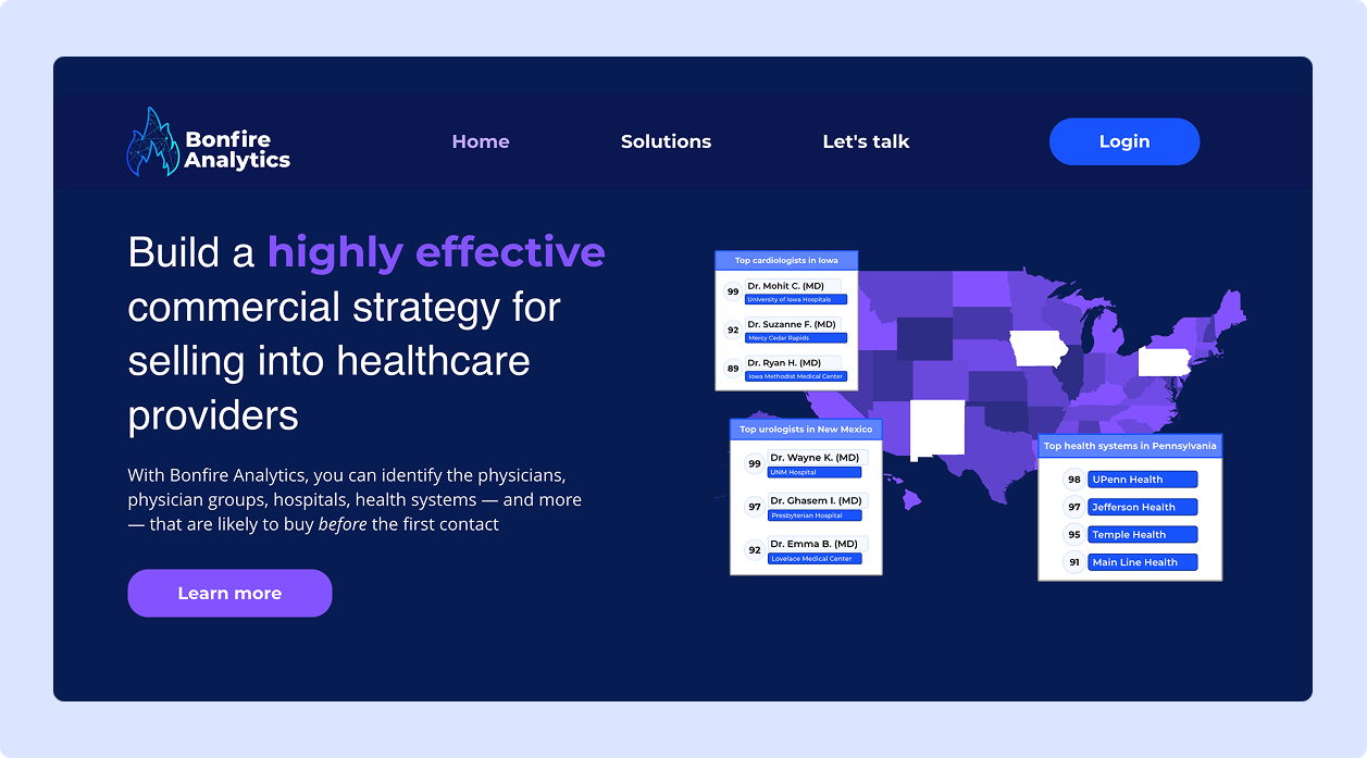
In the end (and after a number of late nights), the website was fully shipped in just over a month. Addressing the core issues we’d discovered during our initial audit, the new site has:
CTA that’s less pressure than “get in touch” or scheduling a meeting
An explanation of the problems customers likely face before offering solutions
Platform explanations that are easily skimmable
Social proof that can be seen all-in-one view
Language, tone, and style that follows the style guide I previously created for the team
This new site also led to a 200%+ increase in inbound leads and an executive team that was pleased with the results.